I led the Arlanda express web redesign that shifted the conversation from price to value and convenience. Arlanda express is a premium, high-speed rail service connecting Stockholm and Arlanda Airport. The existing website was functional but lost potential customers to lower-quality alternatives by failing to connect with travellers on an emotional level and convey the premium, stress-free value.

Challenge: Market share erosion during peak travel seasons due to increased competition from low-cost alternatives.
Project: I led the UX/UI design, responsible for user research, concept development, validation and stakeholder management.
Results: A transformative shift in brand perception, with nearly 80% of travellers citing stronger trust and certainty in the service.
My Process


User Research: Uncovering divergent pain points across user segments
The existing start page focused on speed as the key differentiator and the assumption was that price drove leakage to competitors. This design focused on the schedule, treating the user as if they were already sold. This failed to address the massive amount of cognitive load and stress inherent in airport transfers. New travelers, in particular, were looking for certainty above all else.
Through contextual interviews with travelers and synthesis of user reviews, we found that two major anxiety points dominated the decision: The fear of missing a flight (reliability) and the fear of value insecurity (loss aversion). We discovered that travelers weren’t comparing prices; they were comparing anxiety levels.
These insights meant the start page wasn’t just a transactional entry point—it needed to function on an emotional level. We needed to front-load trust signals and reassurance, positioning the Arlanda express offer as the guaranteed way to defeat travel anxiety, rather than just a fast train.
Our design hypothesis shifted to leading with the value proposition of certainty and peace of mind before presenting the price. But insights alone don’t build trust. Our next challenge was designing for it.
Research overview of traveler user pain points:

Concept Development: Designing for immediate trust
Functional copy did little in the way of building trust with customers who were already burdened with the stresses of travelling, new to the service, and potentially never been to Sweden before. This lack of empathy did not reassure travellers and undermined the premium product one could expect with a high-quality service. We needed to turn the start page from a directory into a Digital Guardian.
Based on our insights and through a series of workshops we developed a concept focused on radical caregiving. The goal was to alleviate the many concerns a traveller could have when choosing an airport transfer provider. These pain points were organized in a pedagogical manner and in order of most prevalent to the largest customer segments to edge cases. We introduced a bold storytelling strategy, engaging visuals and confident use of white space, signaling a premium, effortless experience.
The core concept involved anchoring the many features of Arlanda express’ product in clear, benefit-driven copy that would resonate with a travellers’ concerns for reliability and loss aversion. We streamlined the design system for a more refined use of the brand colours that would direct 100% of the user’s attention to building trust and conversion.
We had strong insights and a radical shift from functional to benefit driven design, but shifting the design paradigm meant nothing if we couldn’t bring the stakeholders on our journey.
Ideation solution wireframes:
Key wireframe features:
- Benefit-driven messaging
- Trust building visuals
- Pain point addressing content
- Intuitive UI
- Advanced user shortcuts
- Conversion driving CTAs
Testing: Development risks mitigated with data-driven validation
Before committing engineering resources to build the start page, we needed definitive proof that the design would successfully reduce friction and increase user confidence over the existing solution. This was crucial for mitigating regression risk.
We conducted remote usability studies using high-fidelity Figma sketches with two distinct customer segments: international tourists and Swedish travellers. The key metrics tracked were; the qualitative trust in the new design, and the task success rate (e.g., finding the buy ticket button).
The results clearly validated the new approach. Participants repeatedly chose the new benefits driven messaging. The simplified use of colour proved successful in testers finding the main CTA – Buy ticket button. Crucially, the updated design successfully translated the brand’s physical promise (speed & reliability) into a digital experience (certainty).
The validation phase gave us and the key stakeholders confidence that the design hypothesis was sound. We used this data to lock in the final high-fidelity design specifications, giving the engineering team a clear, high-confidence roadmap for the solution that directly addressed competitive leakage.
Results from preliminary testing:
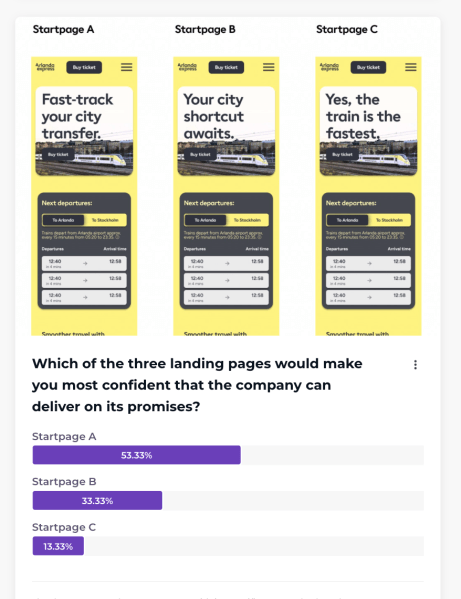
Design hypotheses testing outcomes:
- Qualitative trust in the new design
- The task success rate
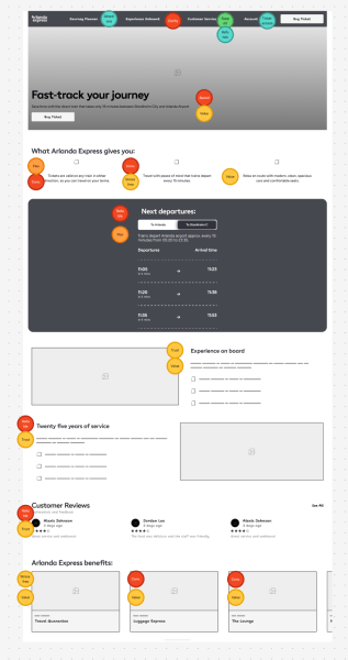
Solution: Storytelling through design
The new design successfully shifted the website’s narrative from a transactional service to a premium, stress-free guarantee. The key was establishing a visual hierarchy that addressed user’ pain points. The successful redesign centered around: 1) Clear, benefit-led storytelling, 2) Intuitive UI design
The structure intentionally facilitates a progressive narrative, moving the user through the experience sequentially with ease. The long-scrolling format of this mobile first design acts as a continuous timeline, ensuring users follow the flow without requiring disruptive clicks.
Storytelling is enhanced by the strategic placement of visual cues. Each content block, starting with a prominent image and a benefit driven title, functions like a chapter in a book, immediately setting the context for the upcoming text and also a stand-alone trust builder addressing different pain points. The consistent use of short, focused paragraphs maintains narrative momentum and reduces cognitive load.
The intentional use of contrasting blocks and integrated media ensures the user’s attention is constantly refreshed as the story unfolds.
Final design sketches:

Key design elements:
- Mobile-first design
- Floating CTA “Buy ticket” button for easy access and to increase conversion
- Clear benefits driven USP messaging
- Trust inducing visuals
- Reliable traffic information
- Product differentiators are clearly defined and communicated
Learnings: Future-proofing the journey
We didn’t just fix a leak; we established a new digital archetype. The most significant learning was the power of archetype-driven UX. When working with a physical service that is fundamentally superior (speed), the digital experience must flawlessly mirror that superiority. Functional communication only justifies the lower-cost competitor; benefits-driven, Guardian-style communication justifies the premium price. Future design work must continually reinforce the message that the Arlanda express is not just the fastest transport, but the fastest route to peace of mind.
Furthermore, we leveraged AI tools to rapidly analyze and synthesize thousands of user reviews, allowing us to proactively identify and counteract potential bias in our initial qualitative interviews. Crucially, while AI informed our hypothesis, validating these design recommendations with real people in usability tests was the key step to ensuring the delivered value matched the user’s true needs.
More projects

From filter frustration to concierge car buying
I led the concept development for an intuitive, personalized natural language car search tool that caters to the complexity of human nature and delivers highly…

Increased productivity through accessible digitization
I reduced customers’ lead time for medical equipment delivery and reduced case worker administration with an intuitive web application. The existing process involved case workers…

Optimizing enrollment through strategic user flows
I drove the growth of jobseekers converting to suitable training opportunities on Arbetsförmedlingen’s website by creating an MVP of customizable educational paths. Before this development,…
Something went wrong. Please refresh the page and/or try again.
